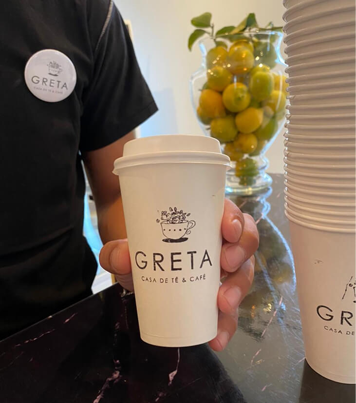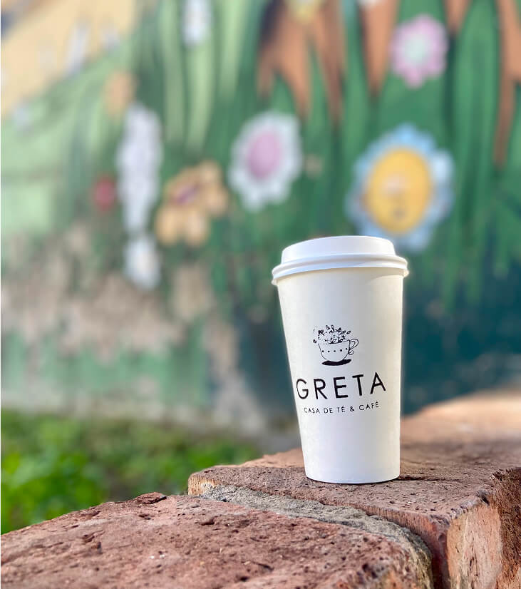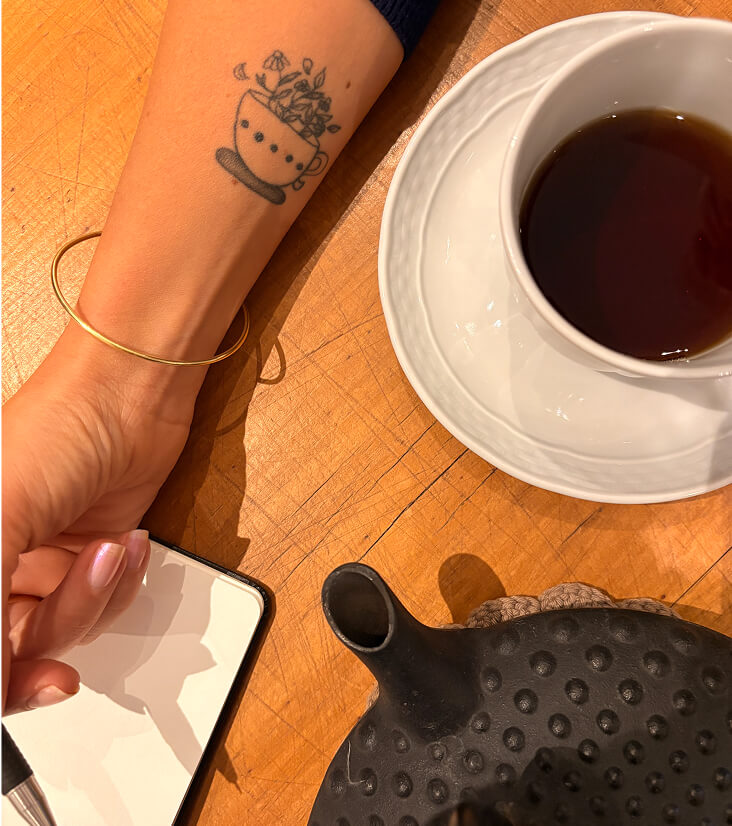
When a local tea house approached me to create their identity, they wanted something that captured warmth, ritual, and personal connection. The project began as a simple logo design — but grew into a visual story that now lives on cups, windows, and even as a tattoo on the owner’s arm.
Techniques: Procreate y Adobe Illustrator.
Seeing the logo in motion — in hands, on shelves, and across social media — was a reminder of how design can connect everyday rituals to brand identity.
The owner loved it so much, she had it tattooed — a truly personal mark of pride.


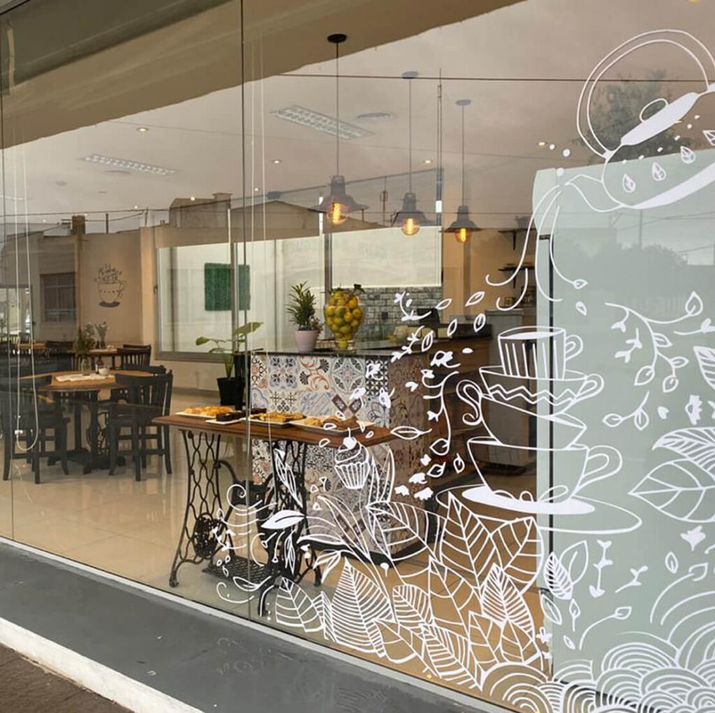
To hide the kitchen area from passersby, I created a complementary window illustration. The flowing lines echo the steam and aroma of a freshly brewed cup and bring the tea house’s natural motifs right to the street view.


During summer, the tea house adds a soft ice cream truck — a seasonal side hustle that needed a visual link to the original brand.
I adapted the logo into a cone, keeping the organic elements and the spirit of the tea house while matching the light, joyful mood of summer.

This project brought together my expertise as both a branding designer and illustrator, building a visual language that continues to grow with the business.
From a cozy café to a community hub to a summer ice cream truck, the illustrations carry personality and consistency across every touchpoint.
I create custom artwork that brings warmth, storytelling, and personality to visual identities, from boutique packaging to editorial campaigns.